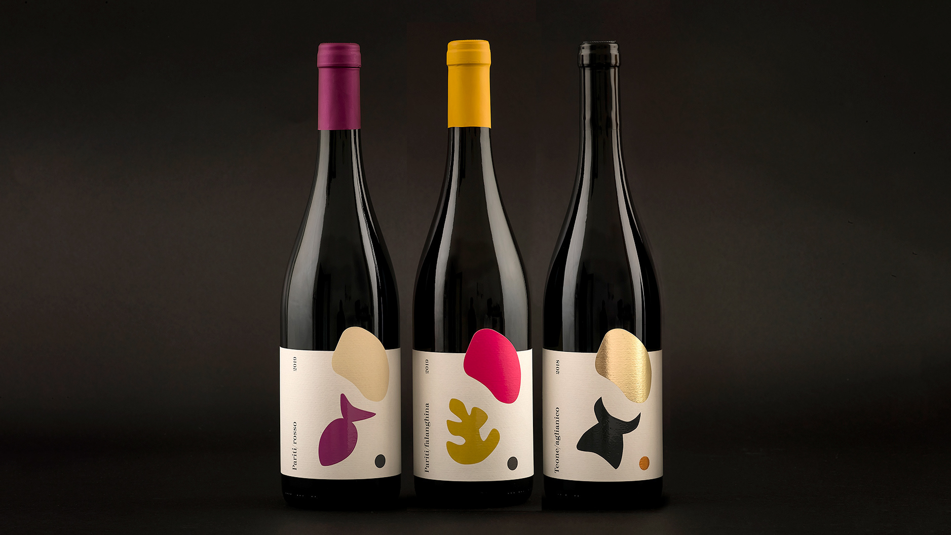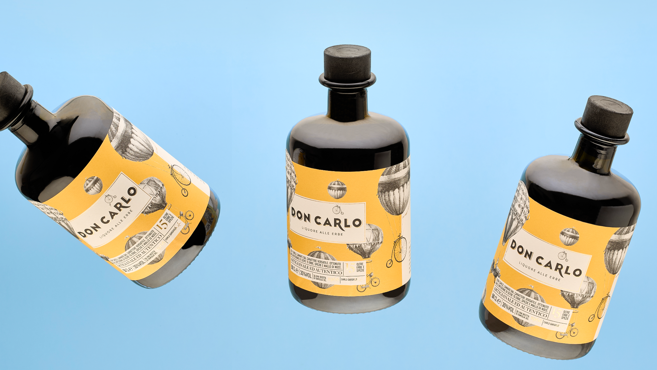
Packaging design for specialty coffee.
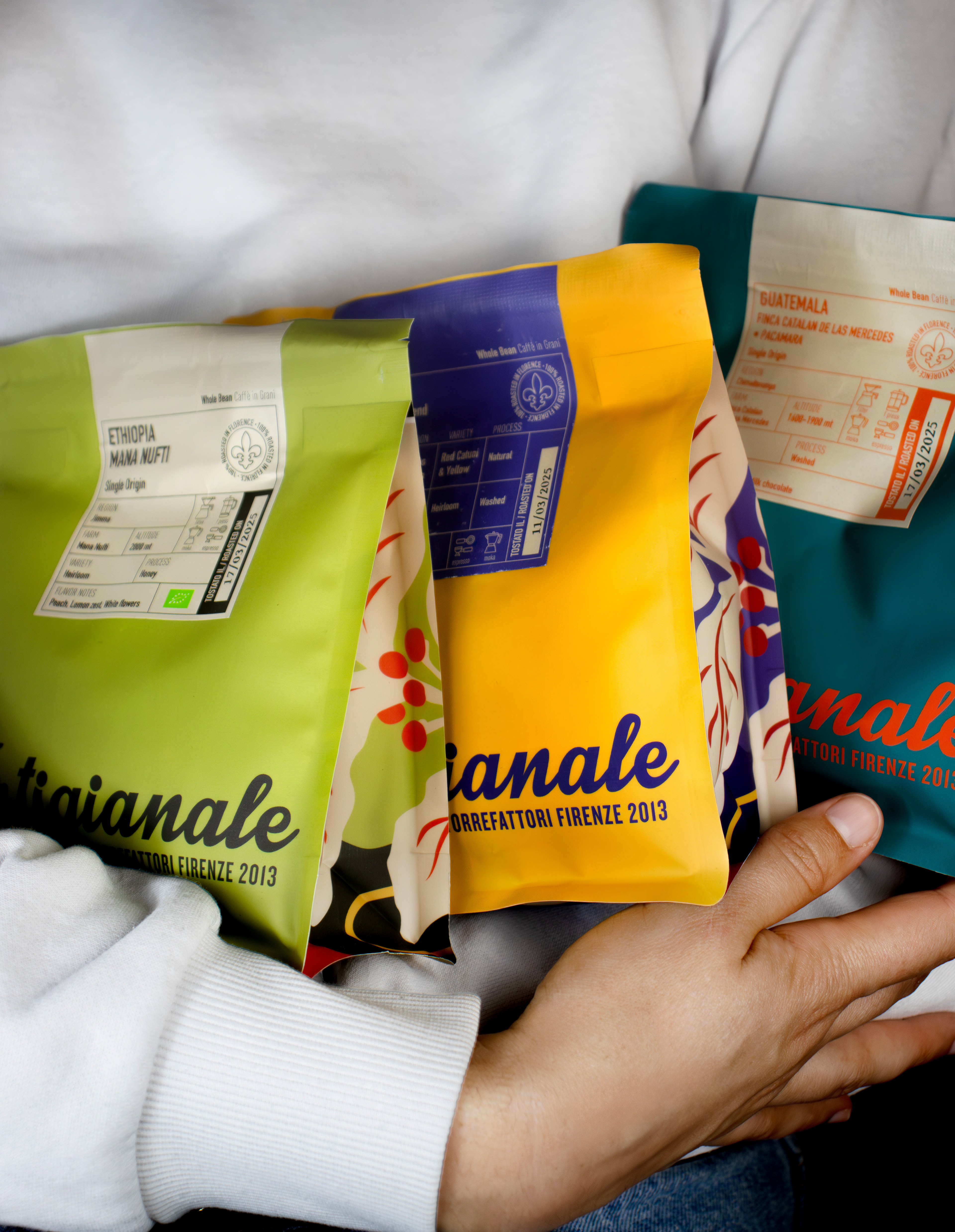
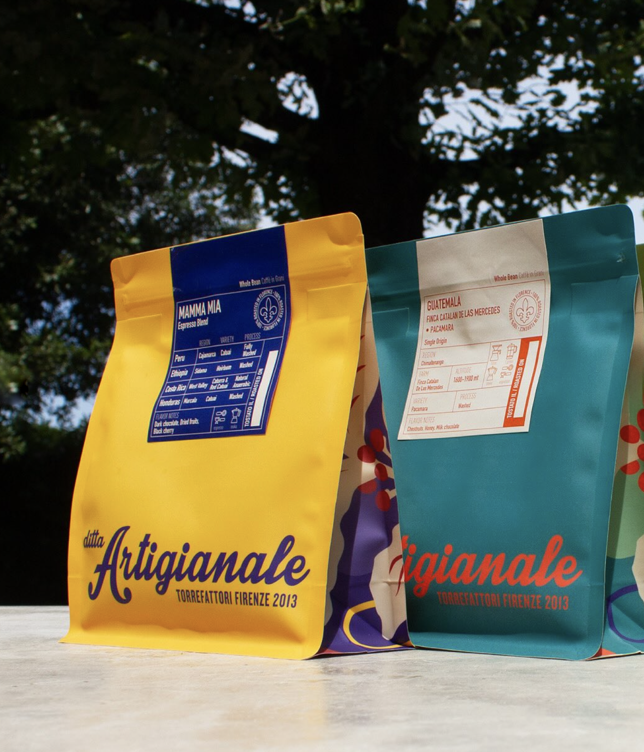
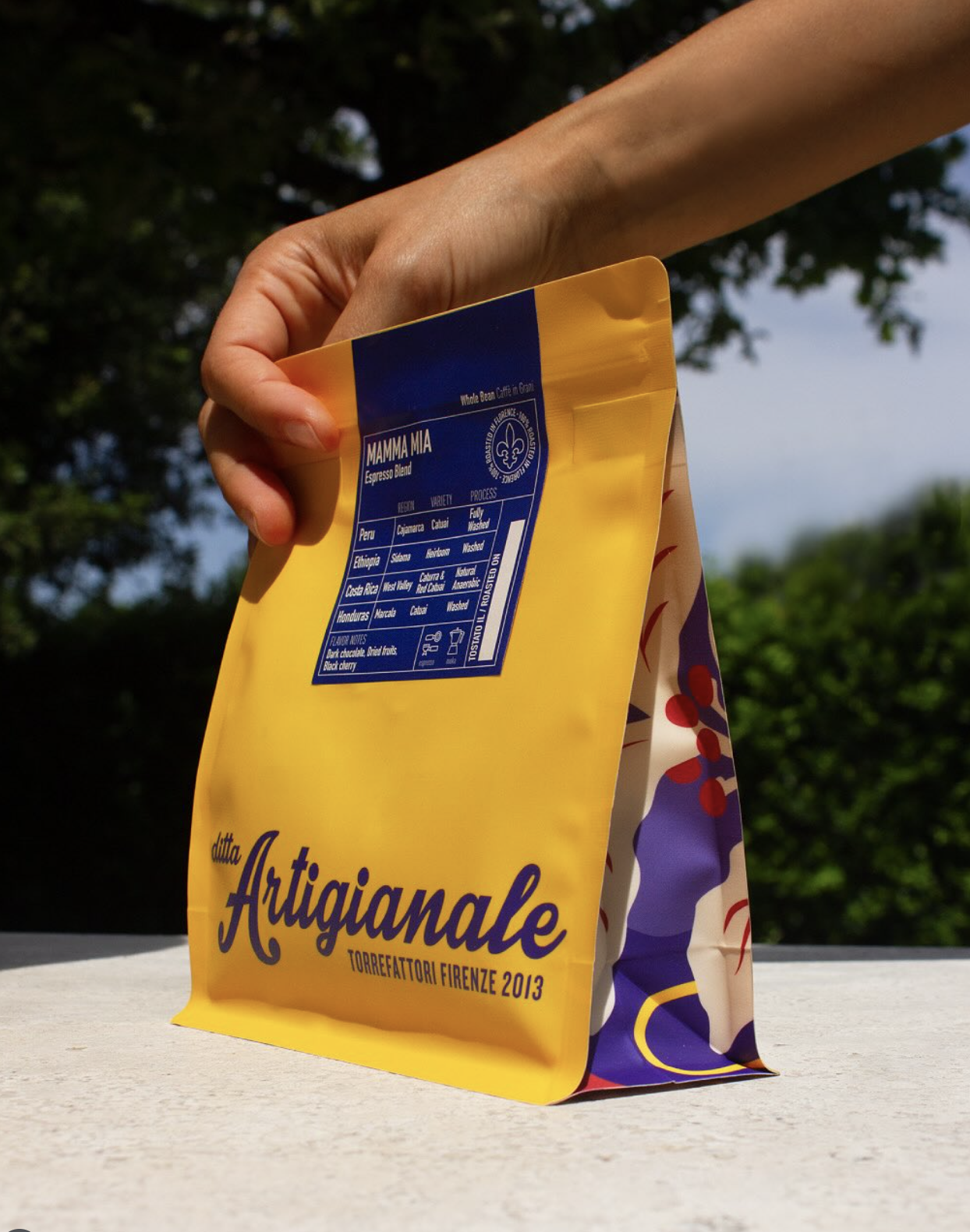
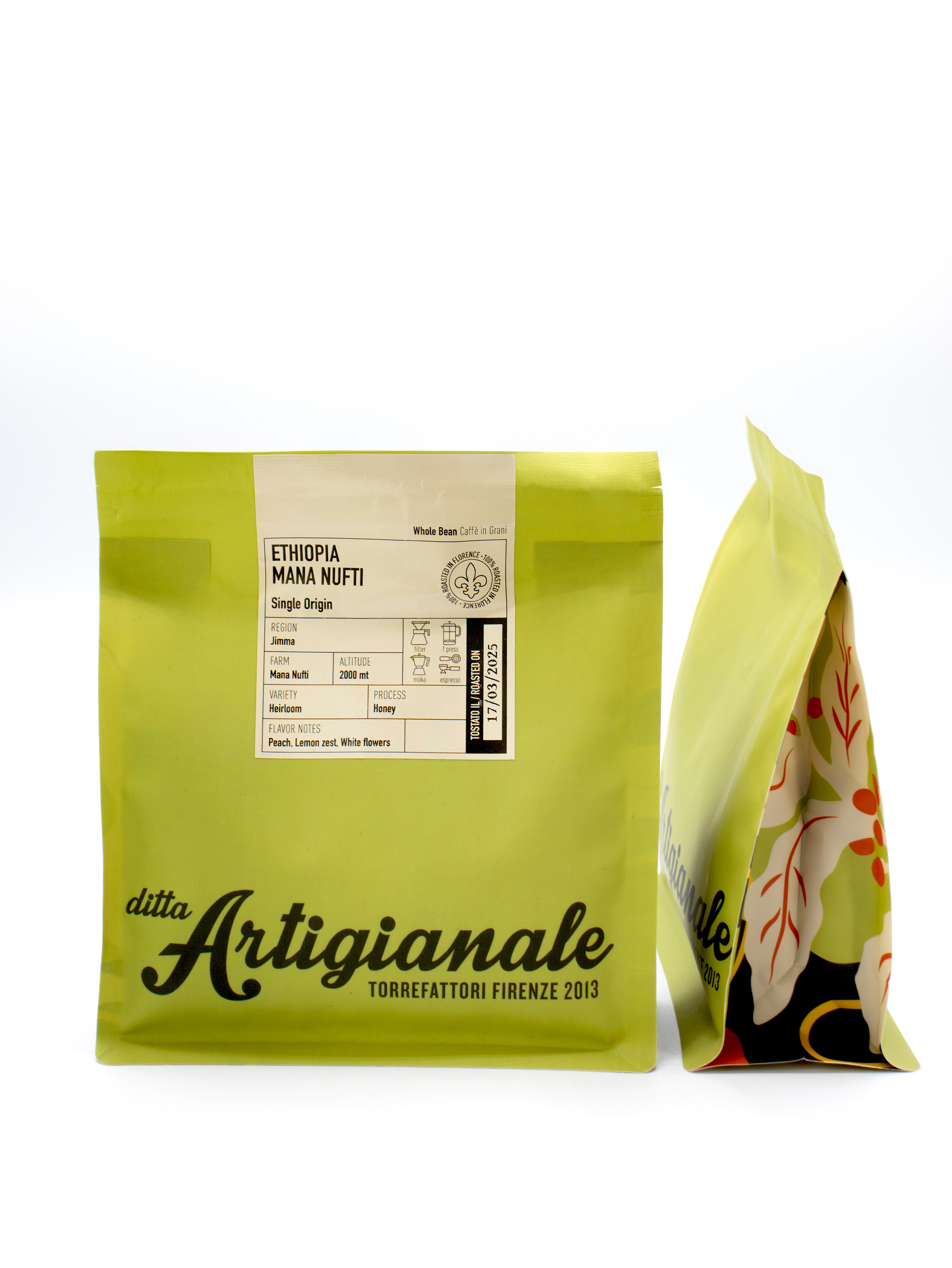
For Ditta Artigianale, an independent coffee roaster founded in Florence in 2013, I developed a visual system designed to immediately communicate the identity and origin of each coffee. The new packaging was conceived as a storytelling tool — one that blends aesthetics, clarity, and purpose to guide specialty coffee lovers through a more informed and engaging experience.
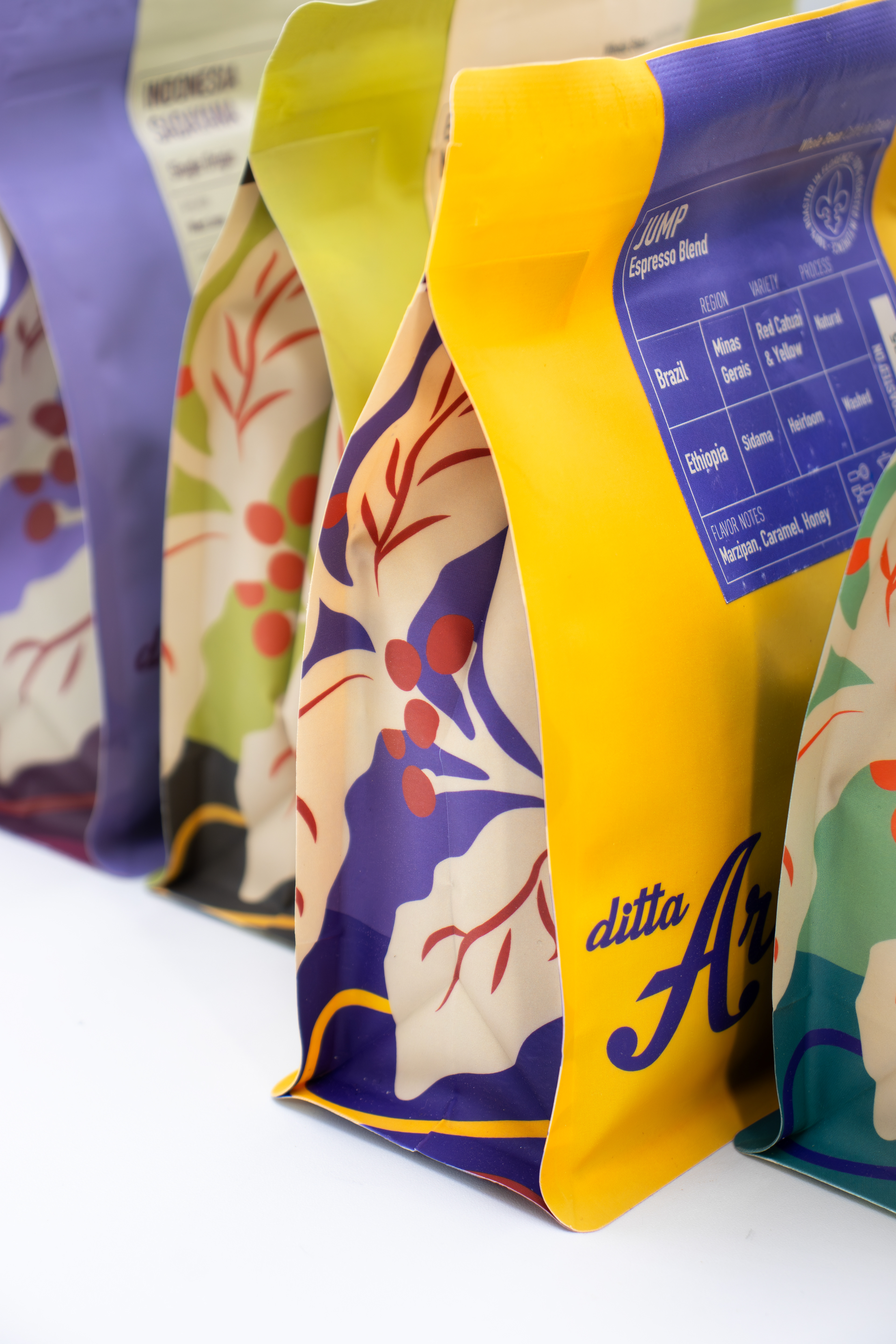
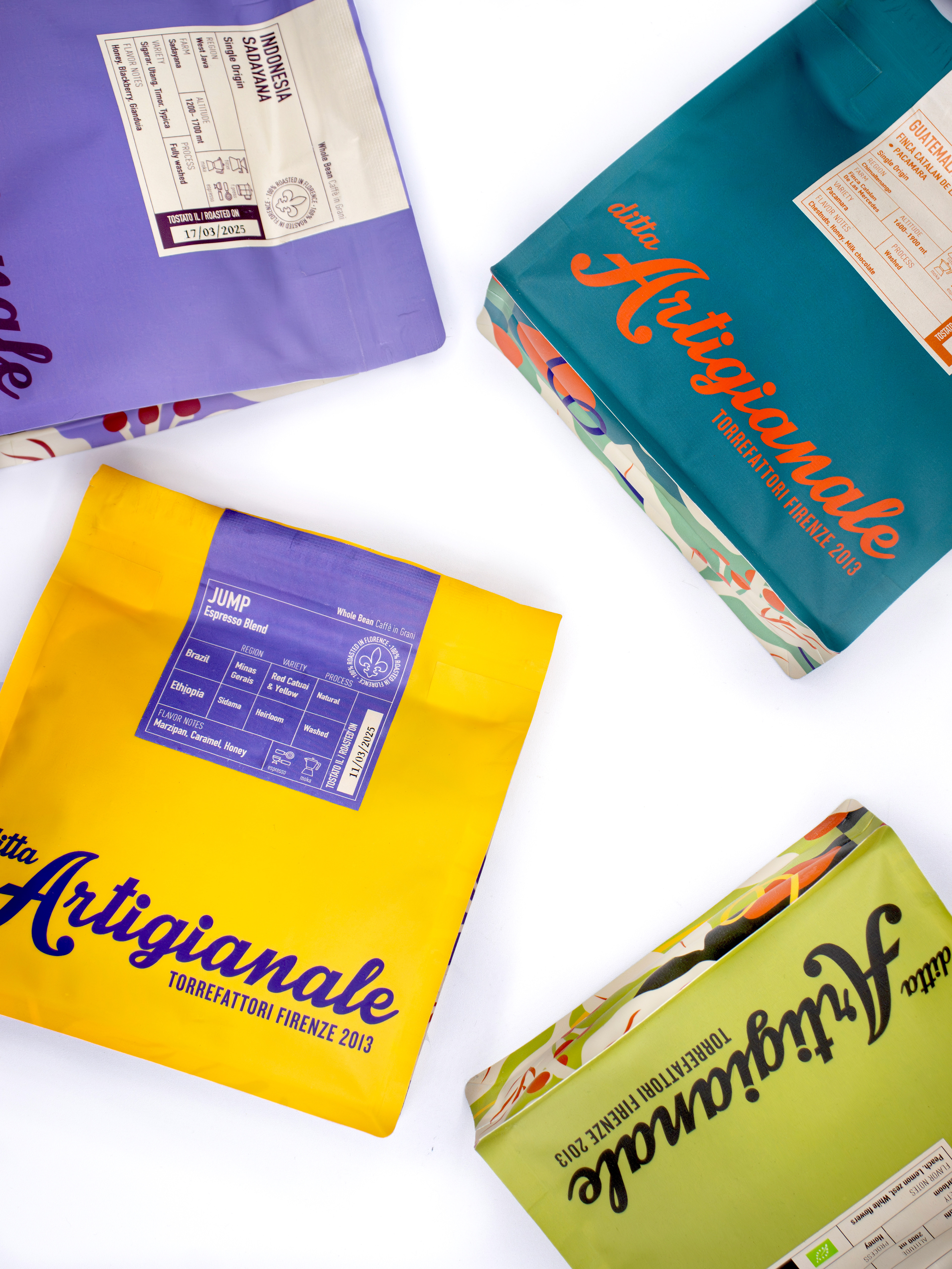
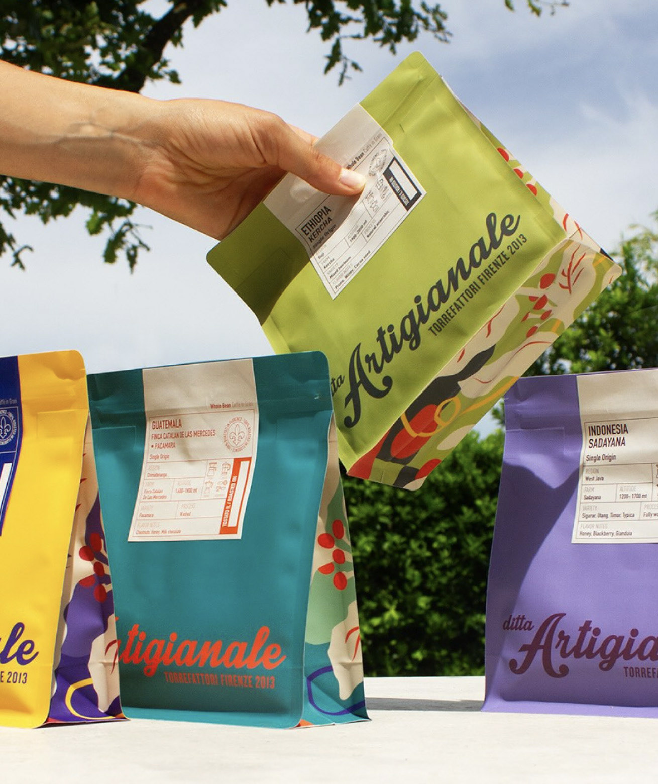
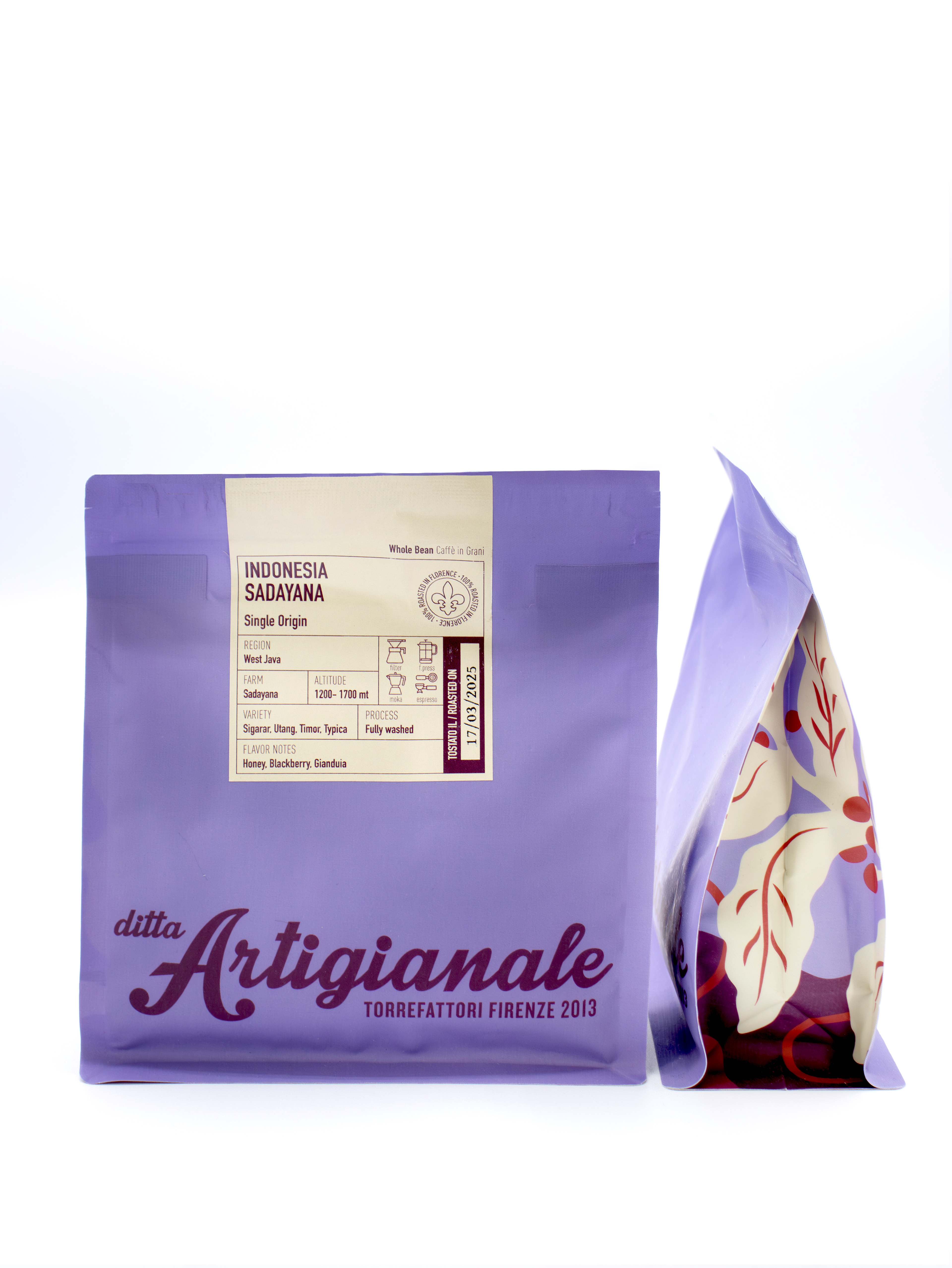
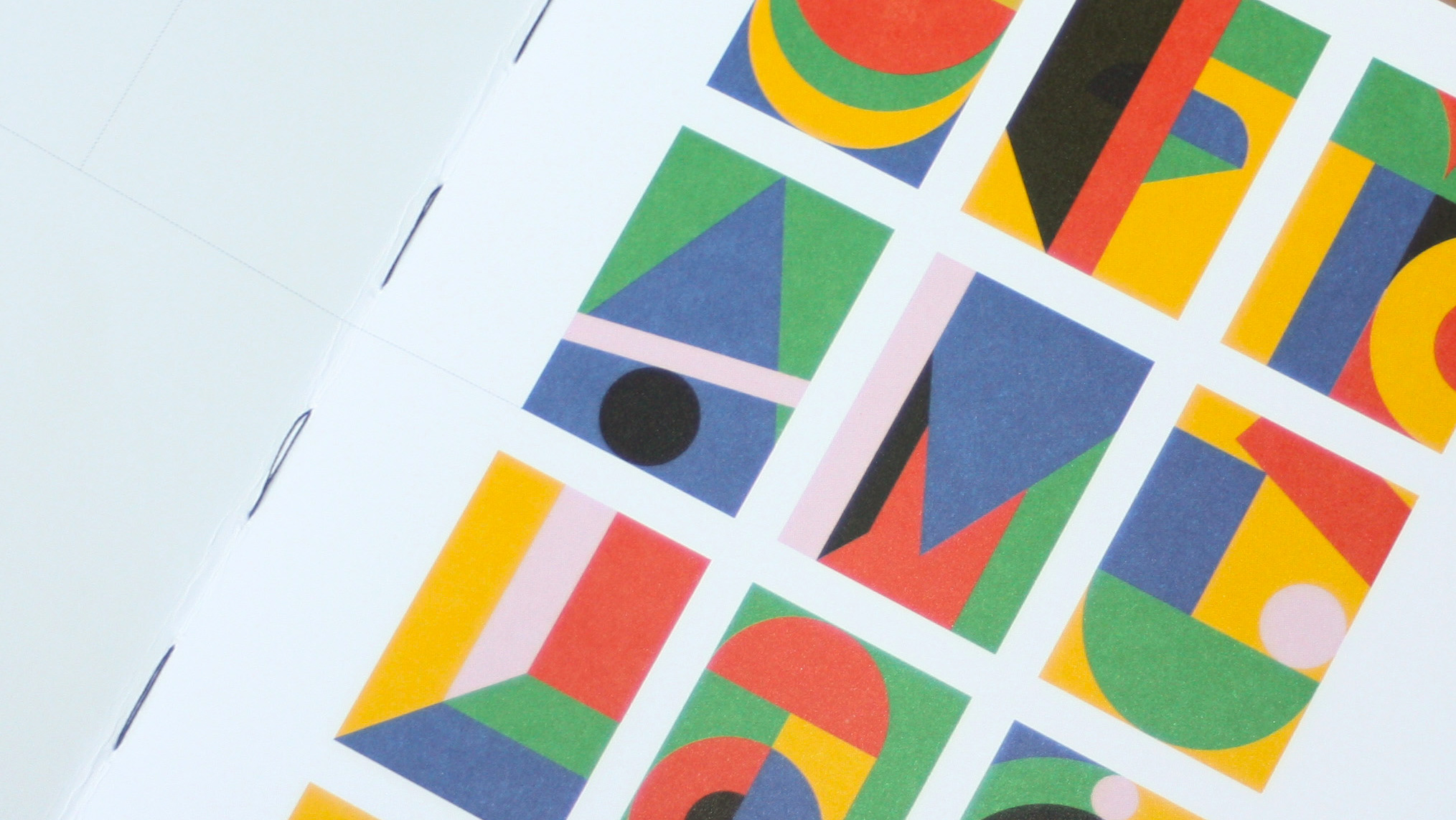
The color palette was carefully crafted to reflect the coffee’s geographical roots: distinct tones represent Asia, Africa, and South America for single origins, while a vibrant yellow is used for the blends produced by the Florentine roastery. Each bag is complemented by a label that works like an identity card for the coffee, packed with detailed information on origin, variety, processing method, and flavour profile designed for those who truly care about what they’re drinking.
Bringing even more personality to the project are the original illustrations by Collettivo Giungla, which add rhythm, narrative, and visual character to the overall design, in line with the brand’s bold and contemporary spirit.
Project team
Mario Cavallaro, creative director at nju:design
Federica Caputo, designer
Collettivo Giungla, illustrations
Category Packaging
Client Ditta Artigianale
Date 2024/25