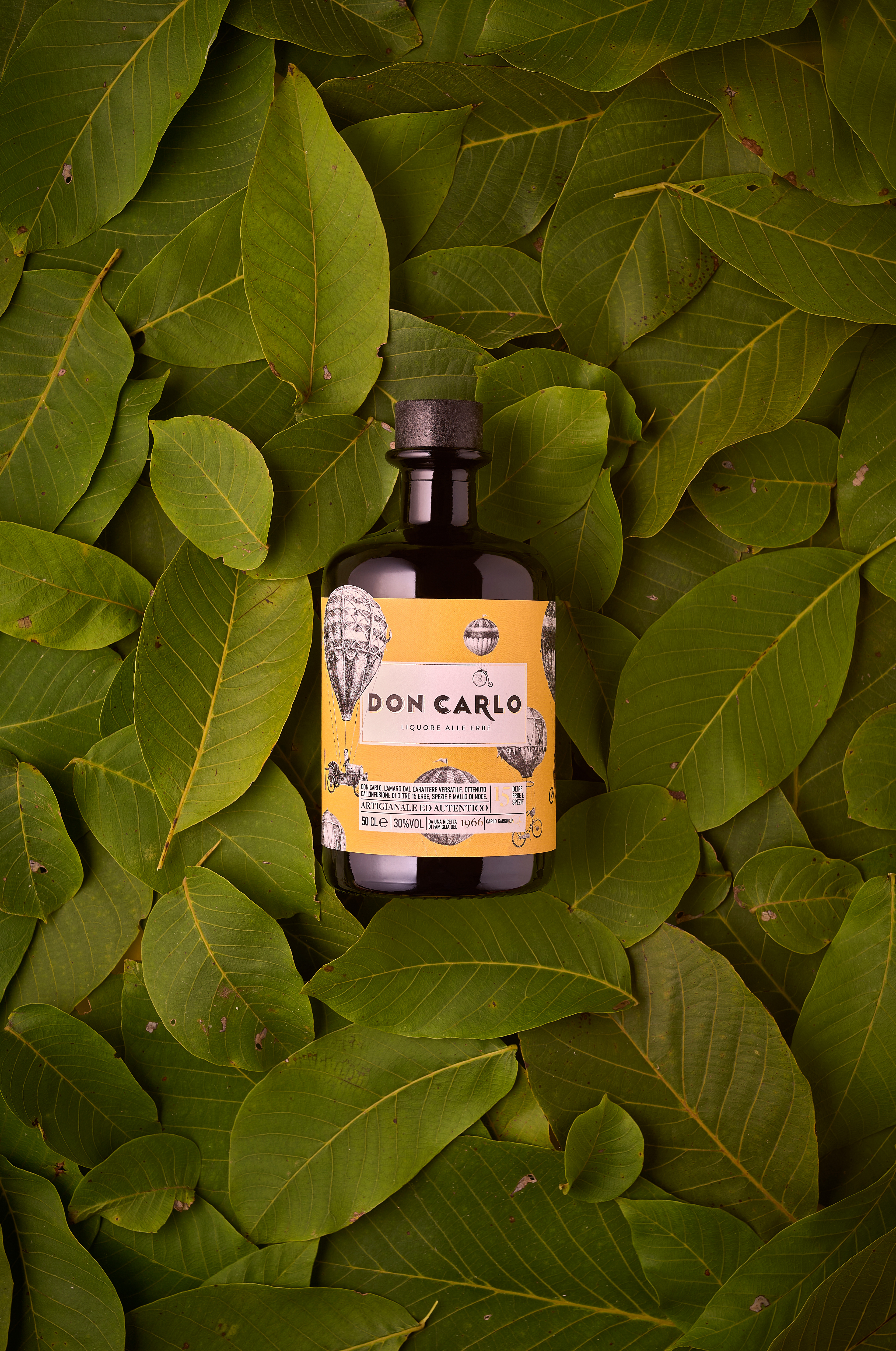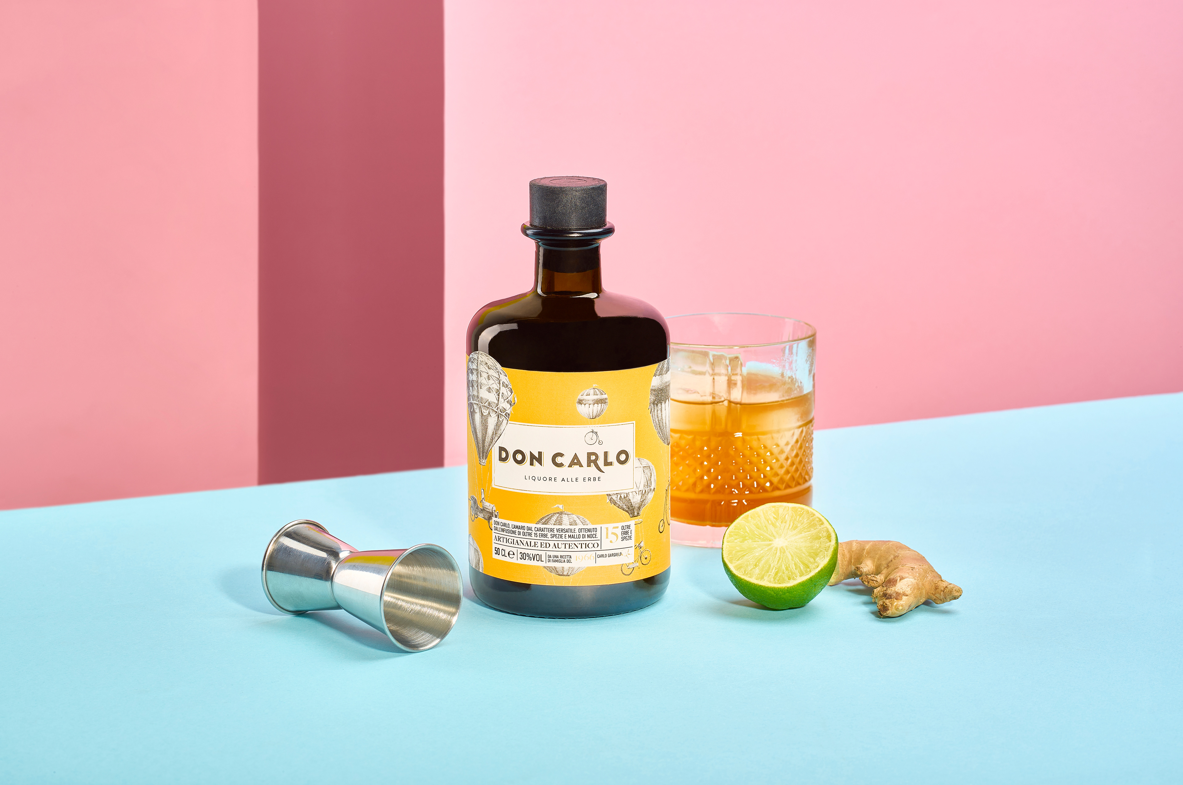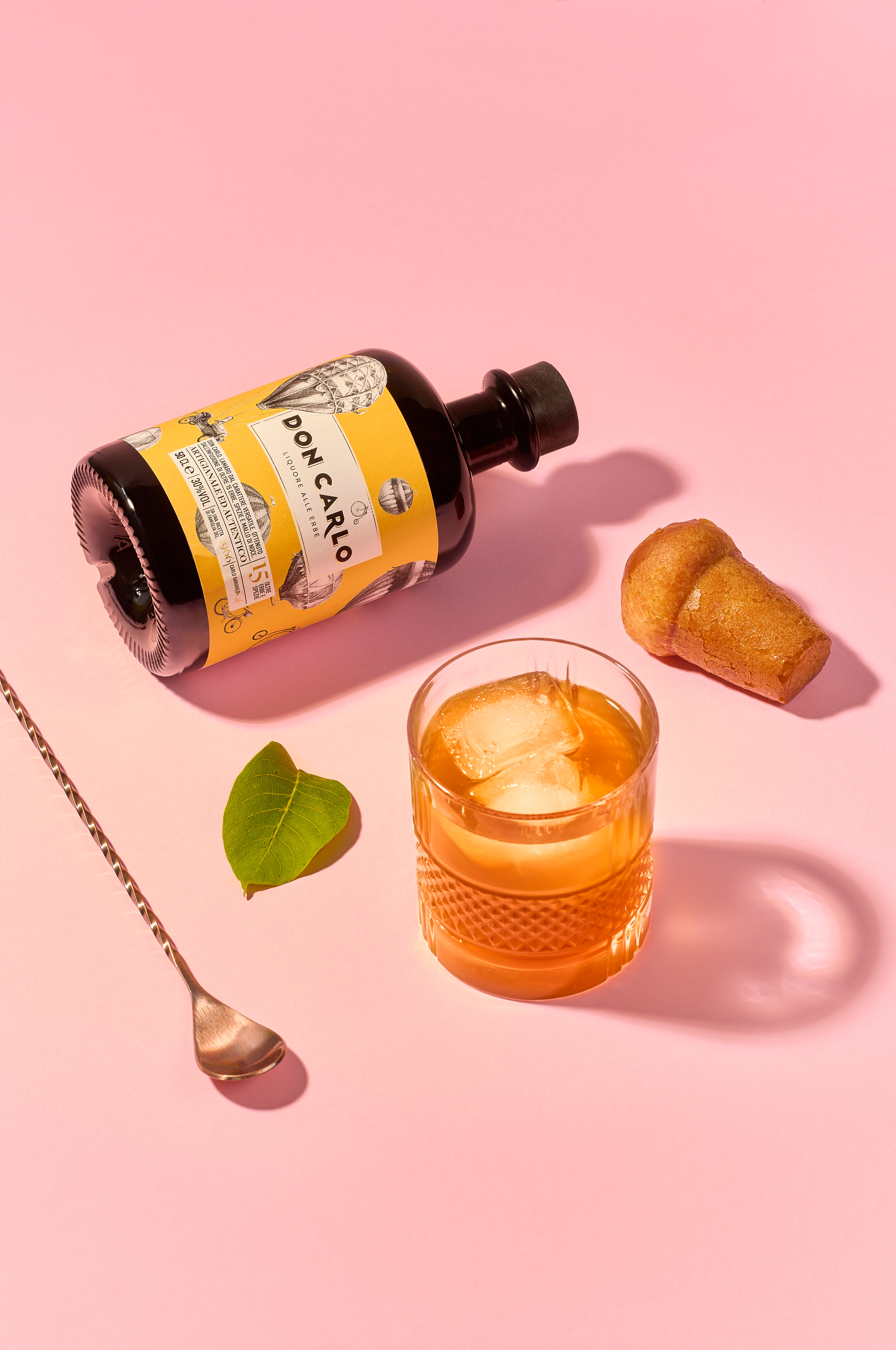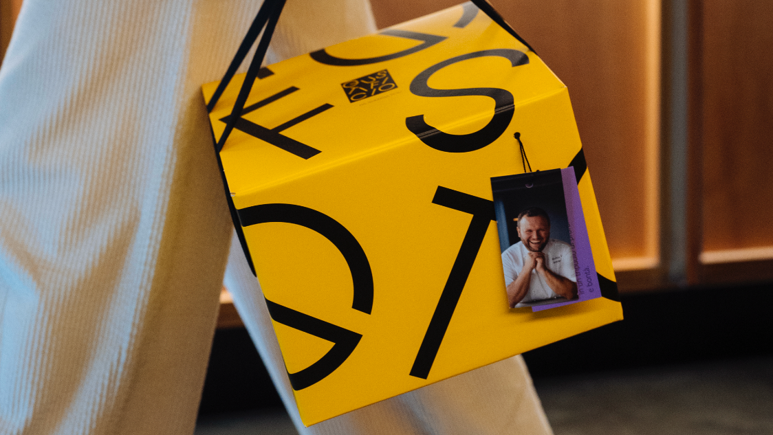
This packaging design for “Don Carlo” liqueur is visually compelling and effectively conveys the essence of the product. The dark, elegant bottle serves as a strong backdrop for the bright, vintage-inspired yellow label, which immediately grabs attention. The intricate illustrations of hot air balloons and bicycles evoke a sense of nostalgia and adventure, reinforcing the artisanal and natural essence of the brand. The green leaves in the background enhance the organic and botanical nature of the product, creating a harmonious connection between the packaging and the ingredients. The typography is clean and modern, with the brand name “Don Carlo” prominently displayed, ensuring easy recognition. The small text details, such as “liquore alle erbe,” underline the handcrafted quality and herbal focus of the product. Overall, this packaging combines sophistication with a playful, vintage aesthetic, making it not only functional but also memorable.
Project team
Mario Cavallaro, creative director
Federica Caputo, designer
Category Packaging / Re-styling
Client Gargiulo
Date 2024