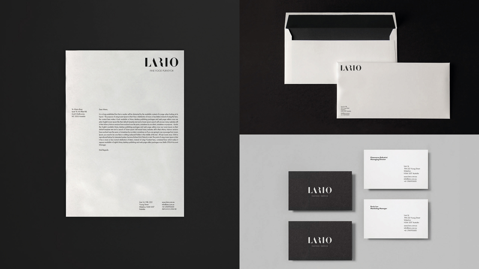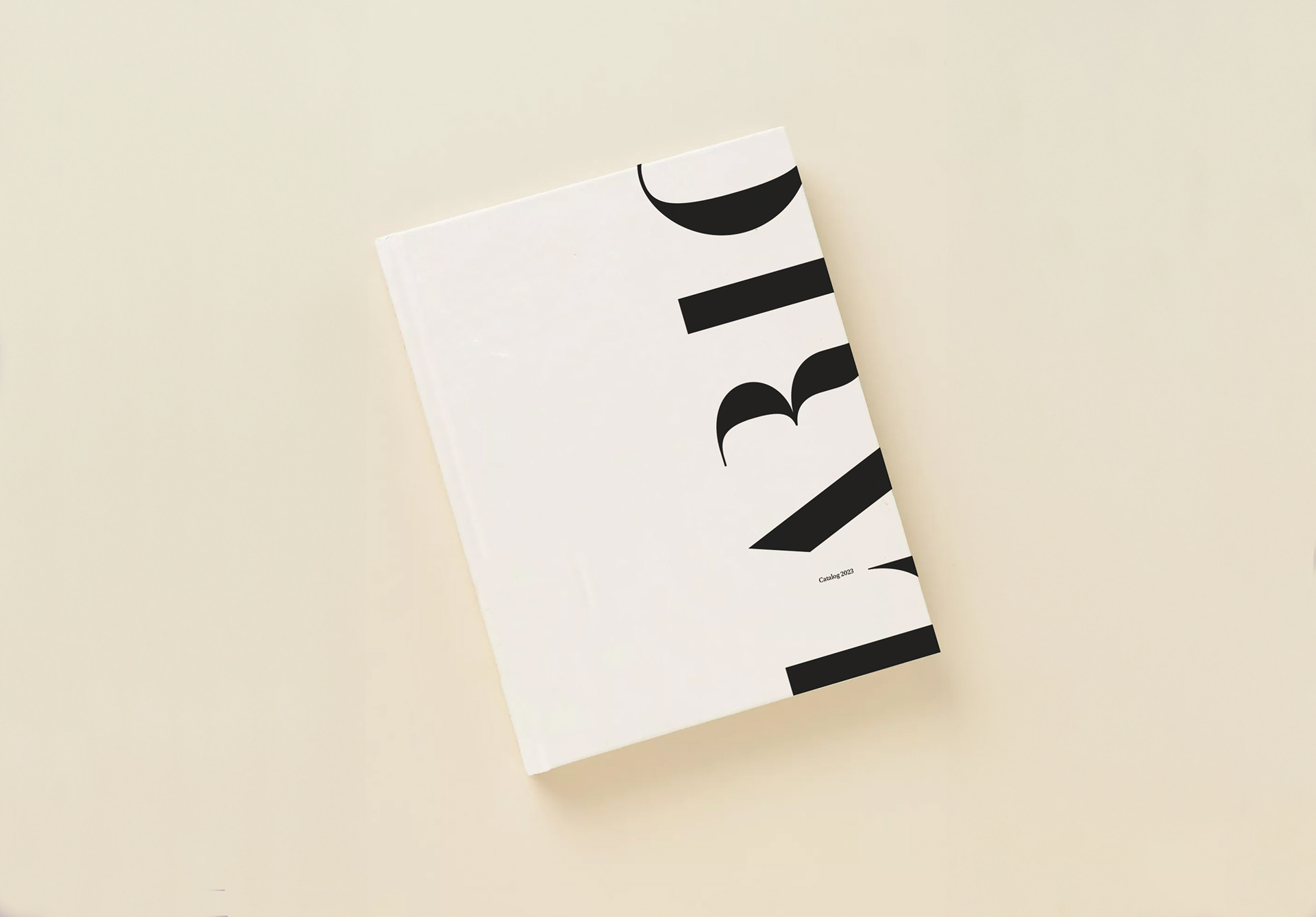
Lario brings Europe’s finest artisanal foods to Australia, extending my collaboration beyond taste to visually redefine their brand. This involved a complete logo restyling and meticulous stationery design. Entrusted with a brochure, I expanded Lario’s printed presence.
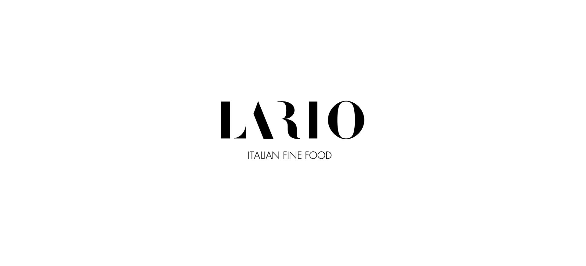
The logo design process embraced minimalism, an intentional approach to distilling each element to its essential form. In an effort to enhance readability, I experimented with eliminating unnecessary parts of the letters. Even when stripping away these elements, the letters remained perfectly legible, adding a touch of modernity to the brand’s visual identity.
Beyond the realm of print, my involvement extended to the tactile experience of a brochure. This piece served as an immersive showcase, providing a glimpse into the richness of Lario’s offerings.
In collaboration with nju:design, our aim was not just a visual feast but to elevate Lario’s brand experience, resonating seamlessly with their discerning clientele.
Category Brand Identity
Client Lario International
Date 2022