I had the pleasure of contributing to the creation of the book "What Makes a Photobook Sustainable?", launched to celebrate three years of research by Sustainable Photobook Publishing (SPP). This volume is a compendium of forty case studies, alongside roundtables, essays, quotes, and insights. Its collective goal is to demystify the publishing process, shedding light on how books are made and emphasising the importance of asking critical questions to make more informed and strategic choices for both people and the planet.
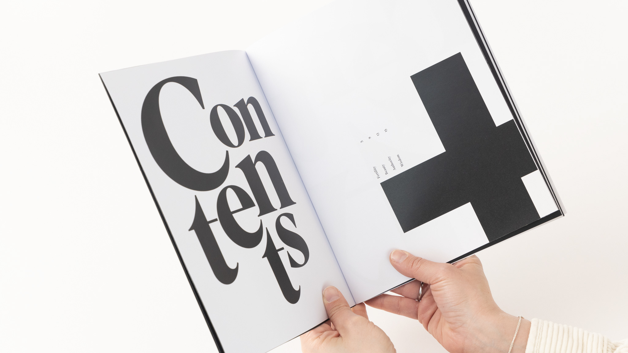
I had the honour of not only creating the cover, which represents all the books cited in the publication but also designing spreads with typographic compositions. Additionally, I included a brief quote of mine on the importance of sustainability from a graphic designer’s perspective.
For the typographic choices, every detail was carefully considered. I specifically chose eco-fonts—typefaces designed to reduce waste. One of these is Ryman Eco, which saves an average of 33% ink compared to standard fonts due to the inclusion of white spaces within the letters, while still maintaining excellent readability. Another eco font used is DIN Silent, chosen for its aesthetic and functional balance.
Eco-friendly fonts are essential because they reduce the environmental impact of printing, especially in large-scale production, where even small resource savings, like ink, can make a significant difference. Opting for eco-fonts is not just an aesthetic choice but a conscious step towards a design approach that minimises waste and actively contributes to sustainability.
These decisions were not made by chance but stemmed from a deep reflection on how our actions—even seemingly small ones like font selection—can contribute to a more sustainable future. In this context, every design choice becomes a step toward a positive impact on the world around us.
Category Publication
Client The Sustainable Photobook Publishing (SPP) network
Date 2024

